Pop Up Modal in React With React useState Hook


This article will walk you through creating a popup modal in React Js using one of the most common React hooks, the useState hook. We will examine the react state and how the useState hook can be used to update a state in React and lightly talk about the passing of props and ternary operator as well. Now, let's get started...!
Create-React-App
To be able to implement this on your device you should have your react app already created and opened in your preferred code editor, in my case, VS Code, otherwise, run the following command
npx create-react-app <your-app-name>
or if you are a yarn person like I am, run:
yarn create react-app <your-app-name>
The process will take some minutes, after all the dependencies have been successfully downloaded, open up the new project in your preferred code editor, run npm start (or yarn start if you installed with yarn) and let's commence coding.
Components
React allows us to break down a complex project into components, and we will be taking advantage of that here as well, although, this is not a complex project, it is a react project, and we will be needing 2 components:
The popup component.
and the button component that will trigger the popup component.
We will be clearing out most of the code in the app.js file, but first, let us get our styling out of the way. Copy the following CSS codes into the index.css. You can of course choose to go with your own styling.
* {
  margin: 0;
  padding: 0;
  box-sizing: border-box;
}

body {
  min-height: 100vh;
  min-width: 100vh;
  background-color: #f1f1f1;
}

main {
  width: 100%;
  height: 100vh;
  display: grid;
  align-content: center;
  justify-items: center;
}

.popupcontainer {
  width: 45%;
  height: 320px;
  padding: 2rem;
  position: absolute;
  top: 50%;
  left: 50%;
  transform: translate(-50%, -50%);
  z-index: 3;
  background-color: #121212;
  color: #00BEFF;
  display: flex;
  align-items: center;
  justify-content: center;
}

.close {
  position: absolute;
  top: 0;
  right: 0;
  margin: 2rem;
  cursor: pointer;
}

.blur {
  width: 100vw;
  height: 100vh;
  position: absolute;
  top: 0;
  left: 0;
  z-index: 2;
  background-color: #c4c4c4;
}

button {
  width: fit-content;
  padding: 1rem 2rem;
  border: none;
  outline: none;
  color: #494949;
  background: #c4c4c4;
  text-transform: uppercase;
  font-weight: 800;
  letter-spacing: 4px;
  cursor: pointer;
  position: relative;
  z-index: 0;
  transition: 0.5s ease-in-out;
}

button:before {
  content: '';
  background: linear-gradient(45deg, #FF00FE, #3FF4EB, #9E00FF, #FF00DD);
  position: absolute;
  top: -2px;
  left: -2px;
  background-size: 400%;
  z-index: -1;
  filter: blur(5px);
  width: calc(100% + 4px);
  height: calc(100% + 4px);
  animation: glowing 5s linear infinite;
  opacity: 0;
  transition: opacity .3s ease-in-out;
}

button:hover {
  transform: scale(1.05);
}

button:active {
  color: #000;
}

button:active:after {
  background: transparent;
}

button:hover:before {
  opacity: 1;
}

button:after {
  z-index: -1;
  content: '';
  position: absolute;
  width: 100%;
  height: 100%;
  background: #ffffff;
  left: 0;
  top: 0;
}

@keyframes glowing {
  0% {
    background-position: 0 0;
  }

  50% {
    background-position: 400% 0;
  }

  100% {
    background-position: 0 0;
  }
}
Creating the Popup Component
In the app.js, delete all the codes and paste these in:
import React from "react";

function App() {
  return (
<div>App </div>
);
};
We are doing this preparation to add our own lines of code.
Now, in the src folder, which is where the app.js is also, create a Popup.jsx file and add the following lines of code:
import React from 'react';

export function Popup(){
  return (
    <div>Popup</div>
  );
};
We are going to now create a card display. This card is what will pop up whenever the button (which we have not yet created) is clicked. Add the following line of code to the Popup.jsx file:
import React from 'react';

export function Popup(){
  return (
    <div className='popupcontainer'>
            <h1> 🎉🎉 Pop Up</h1>
    </div>
);
};
If we go to the browser now, this is all we will see:

We are seeing this because the Popup component is not yet imported and called in the App.js. Let's do that. In the App.js, right after the React import on line 1, add import { Popup } from "./PopUp/Popup" and then, in the return statement of the App.js add the <Popup/>. App.js should look like this now:
import React from "react";
import { Popup } from "./PopUp/Popup";

function App() {
  return (
    <div className="App">
      <Popup />
    </div>
  );
}

export default App;
With that, we are done with the App.js, now to focus on the button component.
Button Component
Still in the source folder, create a PopupButton.jsx component, and add the following code:
import React from 'react'
export function PopupButton() {
  return <button>Click Me...!</button>
}
All we did here is create a button component, and we will be adding it to the Popup component jsx so that it can be rendered in the DOM. So in the Popup component, import the PopupButton at the top like this `import PopupButton from './PopupButton' , and call that in the return statement of the Popup component, right after the popupcontainer div. Your code should look something like this:
import React from 'react';
import PopupButton from './PopupButton;

export function Popup(){
  return (
    <div className='popupcontainer'>
            <h1> 🎉🎉 Pop Up</h1>
    </div>
<PopupButton />
);
};
VS Code should be throwing errors now as the return statement here is expected to only return one element. In order to fix this, wrap everything in the return statement in a main tag. Like this:
import React from 'react';
import PopupButton from './PopupButton;

export function Popup(){
  return (
    <main>
        <div className='popupcontainer'>
            <h1> 🎉🎉 Pop Up</h1>
        </div>
        <PopupButton />
    </main>
  );
};
Now to add popup functionality using React useState hook.
React useState Hook
The React useState Hook allows us to track data (state) within our application so that whenever a change occurs, the corresponding element can be updated in the dom without having to do extra work. useState hook only works with functional components. To use the useState hook, we have to import it into where we want to make use of it like this import {useState} from 'react'. After importing it, the code is written like this:
const [thisState, setThisState] = useState(<initial value>)
The thisState is the state we wish to track. Its initial state is set in the useState and with setThisState we update the value of the state. The initial value of the state only accepts one argument, and this argument can either be a string, number, boolean, array or object.
We will be using the useState hook to determine if our popup should be displayed or not and this is how we are going to use it.
In our Popup.jsx component, add the useState import to the React import like this:
import React, {useState} from 'react';
Now add the useState code inside of the Popup component's function and set the initial value false:
const [modalState, setModalState] = useState(false)
The Popup component code should look like this now:
// react import added here
import React, {useState} from 'react';
import PopupButton from './PopupButton;

export function Popup(){

const [modalState, setModalState] = useState(false);

  return (
    <main>
        <div className='popupcontainer'>
            <h1> 🎉🎉 Pop Up</h1>
        </div>
        <PopupButton />
    </main>
  );
};
Add a function that will update the initial value by calling the setModalState and passing an argument that sets the modalState to the opposite of its current value. Under the useState code, add:
export function Popup(){

const [modalState, setModalState] = useState(false);
const toggleModal = () => {
    setModalState(!modalState)
}
  return (
 ...
In the main wrapper of the Popup component, we will add the block of code that will dynamically display the Popup based on the state using a ternary operator. The operator will wrap the popupcontainer div like this:
 return (
    <main>
{modalState ?
    <>
          <div className='popupcontainer'>
            <h3 className='close' >X</h3>
            <h1> 🎉🎉 Pop Up</h1>
          </div>
    </> : null}
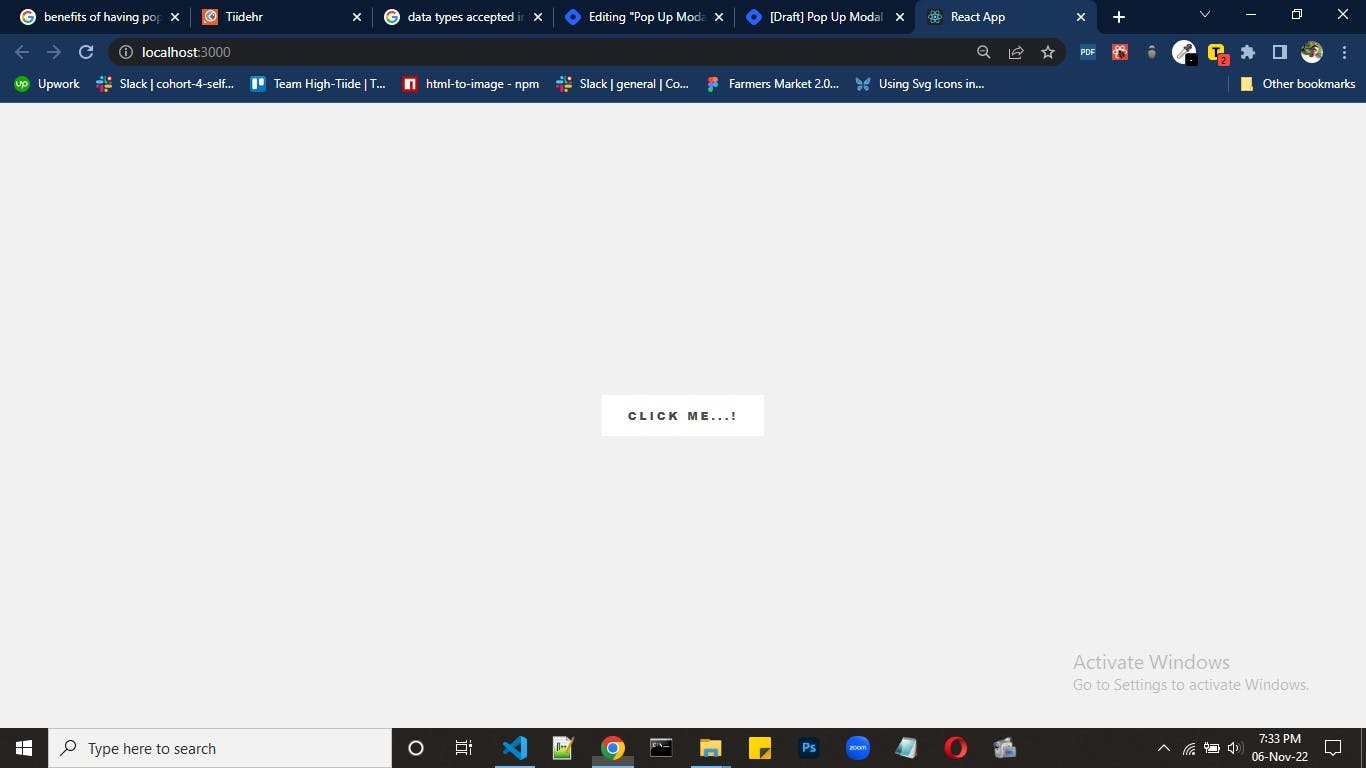
All that should be visible in the browser now should be the button like this.
Now we will add the onclick to the button so that when the button is clicked the popup pops up. The togglemodal function will be called in a few places now. First, it will be added to the h3 with the className of close. Add this to the h3
<h3 className='close' onClick={togglemodal}>X</h3>;
Also, into PopupButton component, we will pass the onClick as a prop, so that we can set it as onClick function. Like this:
<PopupButton toggleModal={toggleModal} />
The full code in the Popup.jsx component should now look like this:
import React, { useState } from 'react'

export function Popup() {

  const [modalState, setModalState] = useState(false)
  const toggleModal = () => {
    setModalState(!modalState)
  }

  return (
    <main>
     {modalState ?
        <>
          <div className='popupcontainer'>
            <h3 className='close' onClick={toggleModal}>X</h3>
            <h1> 🎉🎉 Pop Up</h1>
          </div></>
        : null}
      <PopupButton toggleModal={toggleModal} />
    </main>
  )
}
In the PopupButton.jsx component, the functional props passed will be restructured, and called in the button element like this:
export function PopupButton({ toggleModal }) {
  return <button onClick={toggleModal}>Click Me...!</button>
}
At this point, every thing should be working as we want. When the button is clicked, the Popup should Popup, and on click of the X button in the Popup, the Popup should close.
I hope you enjoyed this one, see in you the next one.
Happy Hacking...